How Tech Dynamix looks and sounds in its web apps: the logos, colors, type, words, and icons. The kit's stylesheet already follows every rule here; this page is the reference for when you build or check something.
Logos
Always use these files. Never type, redraw, recolor, stretch, or outline the logo. Each logo has a light background version and a dark background version; in pages, put both in and let .only-light and .only-dark pick.




- Horizontal
- The sidebar brand row and anywhere wide.
- Stacked
- Message pages (sign in, signed out), above the tagline.
- Icon
- The collapsed sidebar rail only. The favicon is favicon.png.
- One color mark
- Tech Dynamix The icon logo as a solid mark in the text color, #b-techdynamix in the brand pack. For small inline uses next to the name; the files above win everywhere else.
- Photo
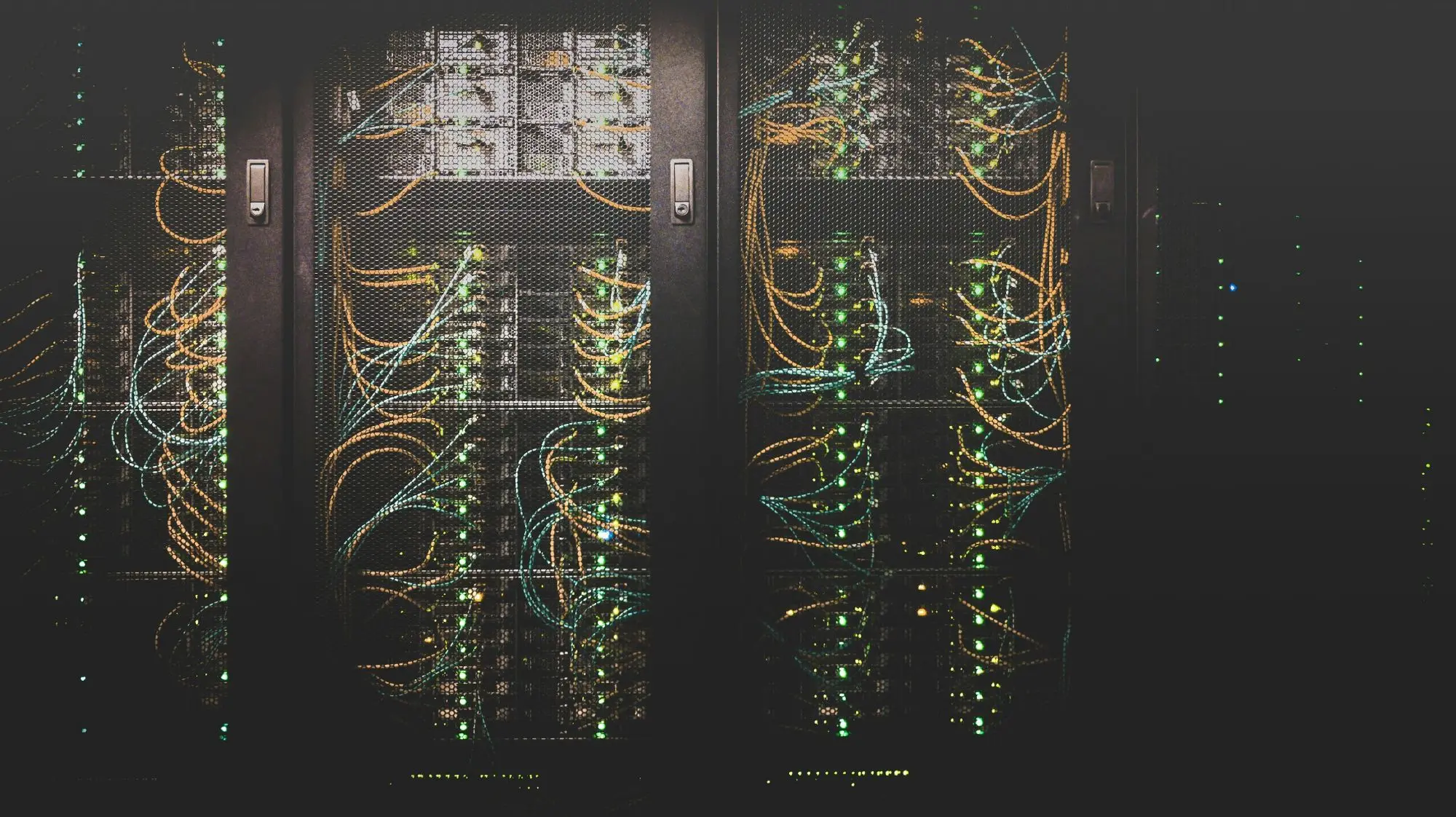
- The server room photo behind message pages: bg-server-room.webp.

Logos and the photo are Tech Dynamix property, for Tech Dynamix apps only.
Color
Click a swatch to copy its hex. In app CSS, always use the token, never the hex, so dark mode works.
Brand
Neutrals
Rules
- There is no green in the kit. Never let red and green carry meaning together.
- Every status color comes with a text label or an icon. A colored dot alone is never enough.
- Dark mode is required. Tokens (var(--panel), var(--text), ...) switch for you.
Type
Five families, each with one job. All are bundled with the kit; never load fonts from Google or any other host.
Chain of custody for every drive
Pickup is booked for Thursday morning. We will call 30 minutes before the truck arrives, and the driver will scan every asset tag before it leaves your building.
1,284 $12,450.00 10/26/2026 98.6%
ITAD-2610001-001
SN 5CG2341XYZ SHA-256 9f86d081884c7d65
TechDynamix
Sizes
| Role | Font | Size and weight |
|---|---|---|
| Page title (page header) | Bricolage Grotesque | 20px, 600 |
| Page title (message pages) | Bricolage Grotesque | 22px, 600 |
| Card title (h2) | Bricolage Grotesque | 19px, 600 |
| Body | IBM Plex Sans | 15px, 400, line height 1.5 |
| Small print, help text | IBM Plex Sans | 13px |
| Table header | IBM Plex Sans | 12px, 600, upper case |
| Stat value | Inter | 28px, 600 |
| ID in text or tables | IBM Plex Mono | 0.9em, 500 |
| Single large ID | IBM Plex Mono | 22px, 600 |
Tagline and wordmark
IT That's Refreshingly Human
- Tagline: IT That's Refreshingly Human, no period, with the orange double underline (.tagline). Usually under the stacked logo on message pages.
- The wordmark is one word, "Tech" in Outerspace (Cloud on dark) and "Dynamix" in orange. Use it only where a logo file cannot be shown, such as plain text emails.
Words
| Rule | Write | Not |
|---|---|---|
| The company is two words in prose. The one word form is only in the logo. | Tech Dynamix | TechDynamix, TD |
| Sentence case for buttons, labels, headings, and menu items. | New user | New User |
| No em or en dashes anywhere in UI copy. Hyphens in compound words are fine. | Saved. The job is ready to close. | Saved, so the job is ready, mostly, to close, with dashes |
| Dollar amounts in numerals. | $250 | two hundred fifty dollars |
| Destructive actions say exactly what will happen and name the record. | Remove asset ITAD-2610001-001 | Are you sure? |
| No emoji in the UI. | Done | An emoji check mark |
Icons
Search all 519519 solid icons from Material Design Icons, in one style only: solid, filled with the text color. Never an outline icon, another icon set, or emoji. An icon always goes with a label, except on square icon buttons (which need an aria-label) and in the collapsed rail.
One meaning per icon
Every app uses the same icon for the same thing. Click one to copy its markup.
Brand marks and states
106 brand marks
Company marks, one color and solid: our own icon logo, plus other companies' real marks only to name a product, integration, or make, always next to its name.
Tech Dynamix Gorelo Microsoft Dell LinkedIn
52 US states
Each state's real outline, for anything about where. Always next to the state's name or code, and never side by side as a map.
Ohio Pennsylvania New York
Components
Every componentButtons
Orange primary, one per view. Violet secondary. Red only for destructive actions.
Status
Wiped In progress Needs review Failed 12 drives
Alerts
Spacing and shape
Everything sits on an 8px grid.
- Radius
- --r-btn 6px buttons and fields, --r-card 8px cards, --r-pill chips
- Sidebar
- 264px, or a 68px rail when collapsed. A drawer at 900px and below.
- Page header
- 64px, sticky, with the page title and the page's actions.
- Content
- Up to 1200px wide.
- Focus
- Always visible, a violet ring. Everything works by keyboard.